Poetrybounding: How Should You Dress Based on Amy Lowell’s Bath Poem?
Here we go again, everyone. This is a new installment of my series called Style-based Poetry: Poetrybounding. If you are new to this series, fret not. In poetrybounding, I try pushing the boundaries of written poetry as a medium of emotional expression into the visual reality fashion presents. There are so many similarities between the aspects of poetry that display the personal language of a writer and the potential of fashion as a visual medium that conveys a person’s image based on who they are and who they want the world to see, that I was able to make a whole series about it, one that could even reach its fifth entry. I tend to pick poems with a lot of imagery because a visual backbone translates nicely into various looks and garments that receive extra meaning from the source material, and this post’s featured piece is no exception.
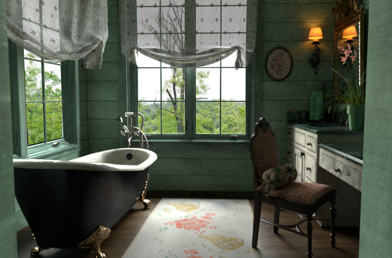
In this post, I will be looking at Bath by Amy Lowell and how she recreates a relaxing scene invoking the colors and light dynamics of water reflecting the morning sunlight in a bathtub and the fragrances of a summer’s day. This poem does not feature many different metaphorical devices to present transitions between visual scenes, so it does not provide a multifaceted composite album that can be segmented and assigned to various garments. Instead, what Lowell does with Bath is choosing one single space and transitioning between variations of the images presented through her different actions engaging with light, water, and the bathtub. This approach to poetry by action and perception grants me a new challenge to the overall look creation, but one that leaves my “design work” less constrained to the formula I have been using so I can focus on an idea more than all the minute details that make them, and opens more possibilities for those who want to perform poetrybounding themselves.
Here is Bath:
“The day is fresh-washed and fair, and there is a smell of tulips and narcissus in the air.
The sunshine pours in at the bath-room window and bores through the water in the bath-tub in lathes and planes of greenish-white. It cleaves the water into flaws like a jewel, and cracks it to bright light.
Little spots of sunshine lie on the surface of the water and dance, dance, and their reflections wobble deliciously over the ceiling; a stir of my finger sets them whirring, reeling. I move a foot and the planes of light in the water jar. I lie back and laugh, and let the green-white water, the sun-flawed beryl water, flow over me. The day is almost too bright to bear, the green water covers me from the too bright day. I will lie here awhile and play with the water and the sunspots. The sky is blue and high. A crow flaps by the window, and there is a whiff of tulips and narcissus in the air.”
The poem starts with a gentle rhyming sentence, setting up the atmosphere of the whole bathroom scene through water-related words like “fresh-washed” and the scent of tulips and narcissus, a smell that is later brought back at the end, cyclically encompassing the poem as to infuse its essence in the sensory experience the piece provides. The second paragraph/verse of Bath depicts an almost purely visual scene where the sunlight coming from the bathroom window shines into the filled bathtub, but the way Lowell describes it grants power to the sunlight and the quality of jewelry to the water, encasing the whole scene in diamond or nacre. Words like “pouring,” “bore,” “cleave,” and “lathes” create vivid imagery that pictures the refraction of sunlight dominating the bathroom atmosphere and being concentrated into light beams that perforate the water surface, coloring the spotlight it forms greenish-white, while words like “jewel” and “bright light” serve to qualify the subject of the severing as gems that upon being subjected to light, break into a myriad of shiny reflective pieces. Because of the aquatic motif, I tend to imagine the reflectiveness of pearls more than diamonds.
The third paragraph/verse is more comprehensive, so there is more to uncover. Lowell commences it with a glaring contrast to the previous paragraph/verse. The sunshine is not a powerful force now, but tiny dancing flickers in the water, ephemeral and delicate. I would see this representation of light due to the scattering of sunshine in the gem-like water surface. The sunlight is also reflected in the ceiling, described in an unmighty manner, with the funny wobbles of waves and the playfulness of the lyrical persona interacting with the water. After she starts interacting with it, the poem describes the color of the water in jewelry terms, beryl being the chosen gem. Emeralds and Aquamarines are beryls, so the idea that water acts like a gem, being both precious and shiny, is further exemplified. And then, the lyrical persona mentions that the water becomes a blanket, covering her from the brightness, or the vehemence and vigor of the day, creating this relaxing and fun environment she can stay hours in. Finally, the poem ends with remarks regarding menial things about the day, like how the sky is blue (always a sign of peace and calm) and how a crow flies close to the lyrical persona’s bathroom window, something that grounds the reader in a shared state with her while she is laying in the bathtub, before going back to the scent that closes the cyclical pleasing atmosphere.
So, what will I extract from this poem to bring into the final look? I chose Bath because of its refreshing and relaxing feel and the aquatic theme. It is a spring to summer kind of poem, resorting to scent notes that can be found in both spring and summer perfumes and the healing and fun nature of playing with sunlight and water. Therefore, I will pull from a beach kind of style to build a look that anyone could wear during the day in a city, but that fits much better with a pool/beach/vacation situation, relying on green-white hues, a soft and light feel, glistering touches (when called for), and wavy shapes to invoke the poem’s atmosphere relayed through its imagery.
Firstly, starting with the upper and lower body areas, because of the poem’s approach to imagery describing the bathroom scene in a more open-ended manner with not many specific visual words, besides beryl, the flower scents, and crow (more on them later), I found three different ways to represent the calming, soft sensations of a body surrounded by water.
The first is to build a look with a nude/nacre-colored chiffon or viscose fabric blouse and a mint/seafoam maxi skirt. That would play with the idea that in Bath, the lyrical persona’s body merges with the water, so the nude color would represent, in an abstract way, the human body interacting with the mint colored skirt representative of the liquid, and depending on the blouse’s shade, it could even look like a rose pearl’s nacre. I could be reaching a little in the pearl part based on my perception of the gem line being this aquatic “stone,” but interpretation is the real crux of the exercise, so whatever you find proper concerning the poem’s atmosphere and message goes. The skirt then would be maxi to fully encompass the lower body, almost like a tail formed by the water, and its chiffon fabric both provides the wobbly grooved pattern representative of waves and the soft and light sensations of the body covered by it. The mint/seafoam hues are not emerald or aquamarine, but they are closer to white-green than those beryl hues, so I picked them as the outfit’s base colors.
Image Via
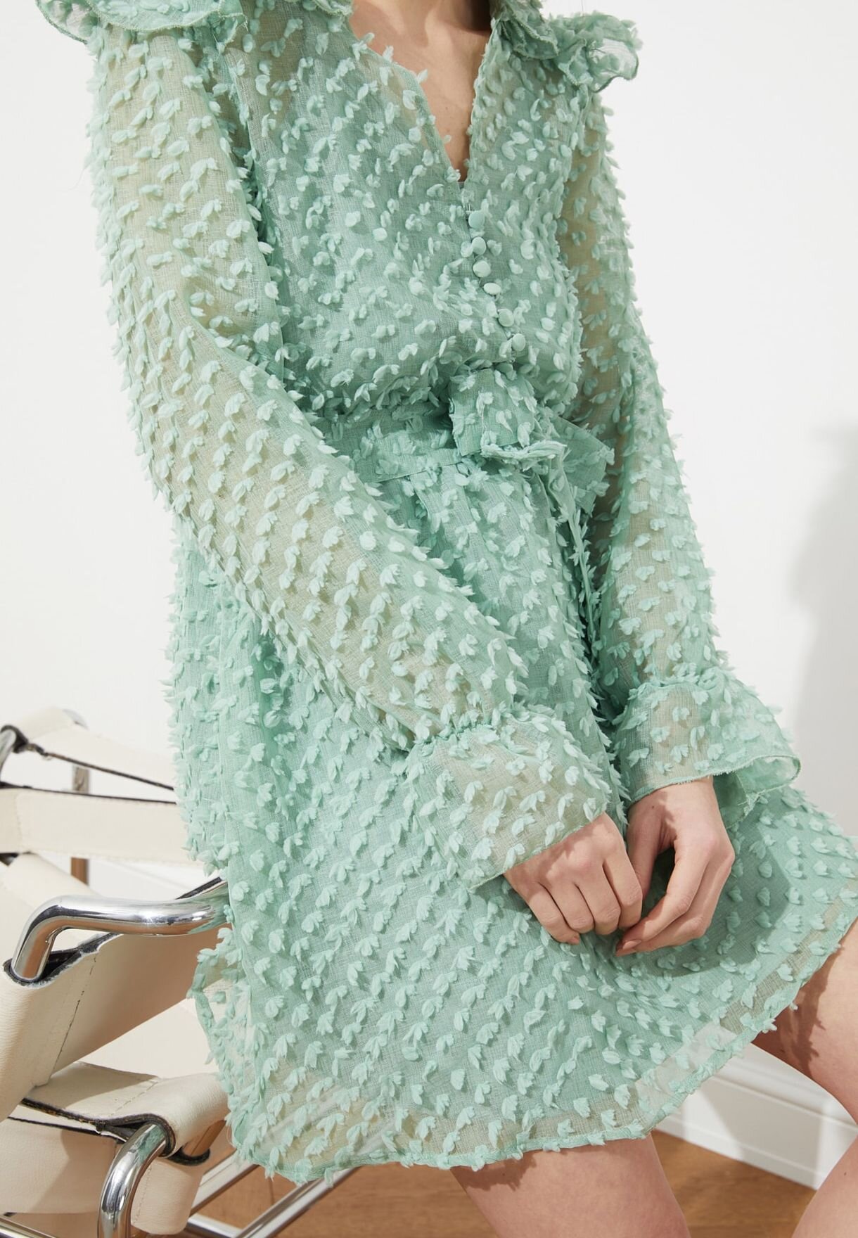
The second and third ways I approached the upper and lower body sections were to flip the color dynamics, finding both a seafoam-colored organza dress covering most of the body and an off-the-shoulder mint blouse that covers much less. The dress pattern style that you can see above is probably unique, so it may not be easy to find another one that replicates the same effect the mesh details create, which resemble a more grounded version of the specks of light Lowell alludes to when she writes “little spots of sunshine lie on the surface of the water” (the refracted light only creates a minor tint change in relation to the rest of the water).
Therefore, a more accessible look involves a crop top, off-the-shoulder tulle (or any other soft and light fabric) blouse that can be paired up with either shorts or skirts since the water is now being represented at the top instead of the bottom, so there is no need for a long garment covering the legs. The choice of an off-the-shoulder blouse works more towards the idea of summer heat and that the water can be perceived as more of a side piece to the body depending on how much of it is covered by the liquid. My first choice of skirt leaned into the nude/nacre proposition I made before, just to create the opposite configuration from the first style, and because the rosy nude/nacre/beige color tonality is very accessible, works with almost all hues, and combines with the summer palette very well. Still, I also wanted to picture Lowell’s depiction of the water as jewel-like, so I also found a shimmer midi skirt that could exacerbate that imagery. The problem with most silver or shining skirts is that they are both heavy and too strong/vivid of a vesture, so instead of promoting the healing and soothing atmosphere, they try to dominate the look and present too much information. Moreover, they are not very day or summer-forward, even if they do shine brightly in the sun (some may look cheaply made even if they are not), and thus I am not as confident about the mint blouse and shimmering skirt set, even though it may fit with Bath.
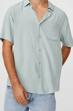
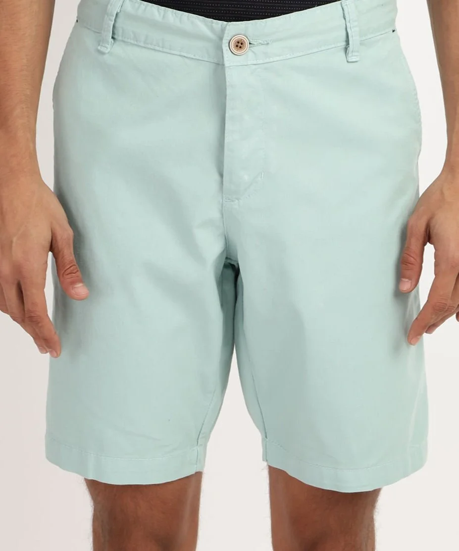
The “male version” of the costume could follow suit with the three types of style I laid out before (fully green, green above and different colors below, or nude above and green below). But, for the sake of time and your interest in this post, I will only depict two. I learned something new about male shirts researching this post. I had a summer shirt type in my mind, but I could only search for Hawaiian shirts, which would not fit the poem’s more individual/personal perspective as they usually are too out there for it. So, after entering a cycle of repeatedly finding gaudy patterns, I decided to search for shirts using fabrics as the independent variable. That was an excellent idea because I ended up finding the exact style of garment I wanted, the Cuban short sleeve shirt or guayabera. They are lightweight, worn outside the pants, and fitting to the smoothness felt in Bath. Most constitute linen and cotton, but as seen above, the one I found is made of viscose rayon. Then, onto the lower region, to create the monotonic sensation of the “full-body” covered in water, mint/seafoam green shorts would do the trick, and to replicate the pearl/sand summer palette, “glossy” beige/nacre shorts would fit nicely as the counterpart to the female design above. It is hard to find chiffon, viscose, or organza shorts, so cotton and even polyester are fine here if they don’t weigh down in the waist.
Image Via
Finally, I should discuss what shoes and accessories could be suitable for the look. In the shoe category, funny enough, I discovered “Tulip flats” from the brand Ilse Jacobsen, which are eco-friendly shoes made out of recyclable microfibers. The light green color is precisely the mint/seafoam hue I have been seeking this whole post, and it features a wave pattern, so serendipity is real. However, the brand is not very accessible in the US, so any mint/seafoam-colored sneakers or sandals would function in this style exercise.
And in the accessory category, the items I found to complement the overall look are much more optional than anything. I believe jewelry is almost necessary to the poem, so I will begin there. On the one hand, replicating the more delicate nature of the reflective brightness of the water surface, a silver narcissus or tulip necklace could be apt for the costume. On the other hand, if you wish to have the crow featured as part of the outfit since the animal is semi visually important to the poem, a bracelet would be a stylistic choice that, even if not very cohesive with the atmosphere presented by Bath, would be more faithful to its contents. Yet, if you are not interested in wearing a crow bracelet, I found a crow-pattern ocean green bandana perfect for the outfit’s summer vibe (it even has embellishments in beige/nacre). Unfortunately, currently, it is sold out. Other options would include pearl jewelry, but most rings and necklaces could cost twice more than the outfit itself, so this is under your discretion. Lastly, of course, perfumes are probably the only medium that could genuinely invoke the scents of the poem to fully complete its atmosphere. To do so is to be a dedicated fan of poetrybounding, but here is a suggestion nonetheless: Carat by Cartier, which features middle notes of tulip and narcissus, a rare combination on itself, entwined with other various flower scents, but that is just subtext.
In sum, the spring/summer outfit I designed this time around benefits from not being singular, following the more scenic approach I took to analyzing and translating Bath, a poem that is as visual as the atmosphere it creates. The driving color was the mint/seafoam hue that I interpreted as the greenish-white tint of sunlit water Lowell mentions, crucial for constructing the bathroom scenery when coupled with the soft fabrics I also picked intended to tactually translate the lightweight and soothing touch of water. In contrast, the secondary colors inside the beige/nacre/nude spectrum and around shining silver, based upon my interpretation of the poem and its visual appeal (pearls, diamonds, the human body, etc.), were less critical to the overall look. The accessories are a mix of different configurations the look could take, which also benefited from the more arbitrary nature of Bath, and because of the Pandemic, any monochromatic mask made with the colors mentioned in this post goes. I was even able to almost fully develop a “male” outfit for this interaction of poetrybounding, which goes to show how many possibilities style-based poetry may present. In the end, a poem can be, and many times should be interpreted differently by each reader, so my guide is only a glimpse into the realm that connects both fashion and poetry.


